
Top Membership.io Hub Examples for 2026
Let’s be real for a second.
If you are like so many of the clients I work with, you are sitting on a goldmine.
You have years of content. Courses you launched once. Masterclasses, webinars, and live Q&A’s that were pure magic. Podcasts that answer the exact questions your clients are asking right now.
But right now? It is probably all sitting in Google Drive folders. Or lost in a Slack thread. Or buried in an old course platform that feels clunky and "duct-taped" together.
I see this every single week.
You look at that pile of content and you don't feel proud. You feel heavy. You feel like you should be doing something with it, but just thinking about organizing it makes you want to take a nap.
Here is the good news.
You do not need to create more content. You just need a better container.
I have spent 30 years in marketing and business. I have seen trends come and go. But the one thing that never changes? Clarity wins.
My entire business at Shell Creative is built on taking that overwhelm off your plate. I take your "messy middle" and build it into a Membership.io hub that feels calm, professional, and completely handled.
We aren't just dumping files into a library. We are building a home for your expertise and your community.
We want a space that feels easy-breezy for your members. A place where they can find exactly what they need, get a quick win, and feel good about being there.
And we want a space that is easy for you to manage. No complex coding or tech experience required (you don’t need an IT degree to run this thing.)
Whether you are running a traditional membership, a course library, a coaching hub, or a training center, Membership.io (formerly Searchie) is the best tool I have found to make this happen.
It allows us to let the wheel do the work. We take what you have already created and give a home.
Below, I have pulled together some of the best examples of Membership.io hubs I have seen and built.
As you scroll through these, don’t look at the volume of content. Look at the structure. Look at how personal and customized it feels.
This is what is possible for you, too.
Now, let’s look at what good design can do.
What Strong Membership.io Experiences Have in Common
Across every solid Membership.io hub I have worked on, the same patterns show up. Nothing fancy. Just really intentional choices.
The strongest experiences aren’t flashy. They are thoughtful.
They focus on:
Clear starting points so people know exactly where to begin
Cohesive visual design that reflects the brand and feels good to be in
Layouts that make next steps obvious
Search, tagging, and filtering that keep content usable as it grows
Easy ways to get help or answers without friction
Frequently used tools surfaced clearly, like calendars, replays, and resources
A balance between guidance and exploration
Design choices based on how real people show up and what they want to know vs. what the owner thinks they should know (many times these are different)
You will see these principles woven through the examples below.
Examples of Guided Onboarding & Pathways
These examples excel at answering the question: "Where do I start?"
Autism Little Learners This Membership.io experience is a beautiful example of leading with care. You can feel it right away. Instead of dropping members into a giant library, the homepage offers gentle, confidence-building entry points like Start Here, Your First Quick Win, and Feeling Stuck? The tone stays calm and reassuring. It helps members build confidence instead of feeling flooded.
What works especially well:
A visual Success Path that shows the bigger picture
A dedicated Quick Win experience to encourage early action
Clear separation between onboarding, monthly focus areas, and long-term resources
Warm, human language and branding that feels fun and supportive instead of instructional
This is Membership.io used as a true learning environment, not just a content container.
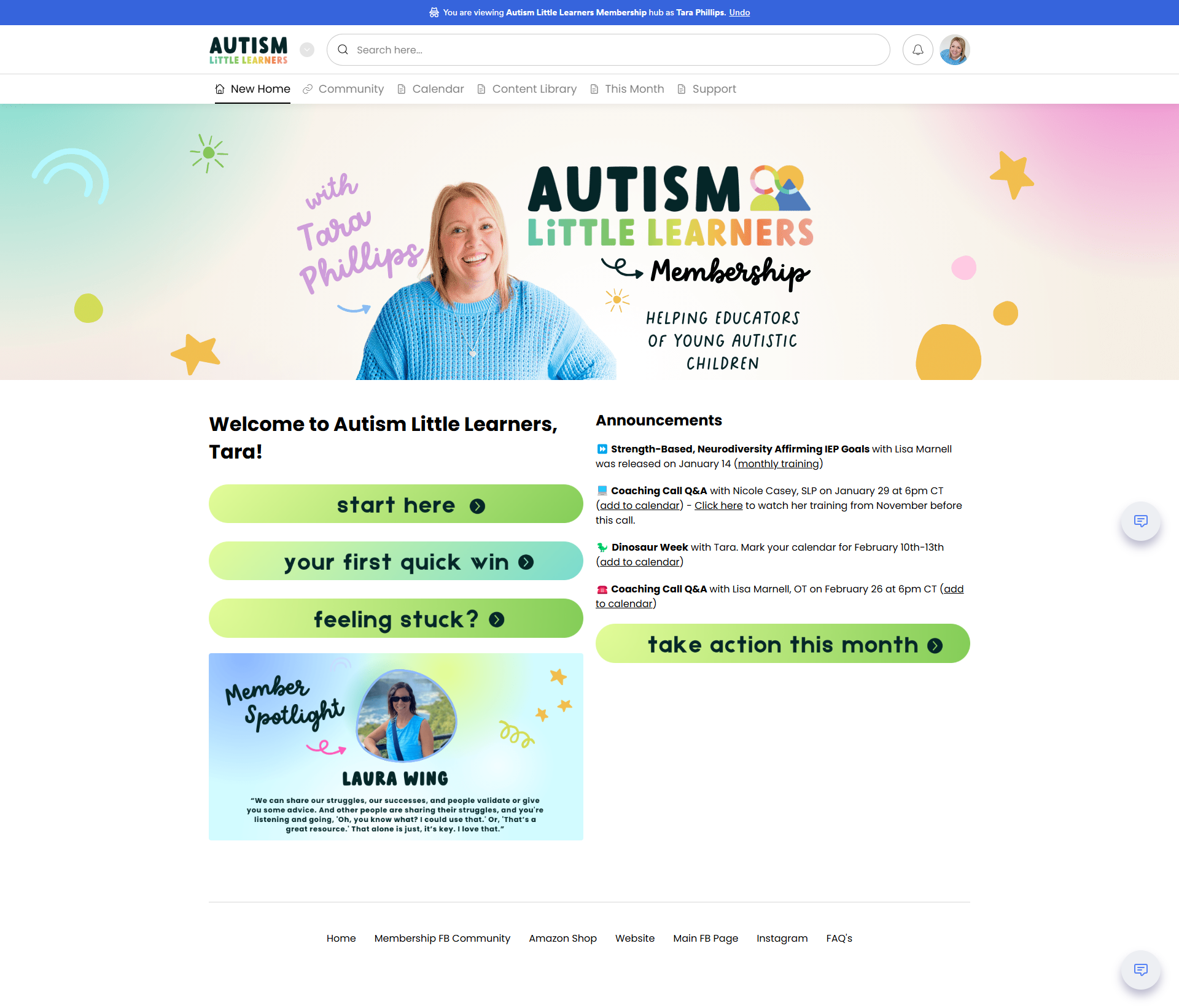
Autism Little Learners: Notice the clear "Start Here" and "Quick Win" buttons that lower the pressure immediately. www.autismlittlelearners.com
Parenting Boys Peacefully This Membership.io experience is built around a simple but powerful idea: what you need today may not be what you needed last week.
Instead of forcing parents through a fixed sequence, the hub invites them to orient themselves based on where they are right now. The Path to Peace visually lays out the core areas of support self-care, connection, limits, play, and not doing it alone while giving parents the freedom to choose what feels most relevant in the moment.
Some days, it’s about connection. Other days, it’s about limits. And sometimes, it’s simply about remembering you don’t have to do this alone.
The design makes it easy to re-enter the space again and again, choose a different focus, and get support without starting over or feeling behind.
Why this works:
Navigation based on current needs, not a fixed curriculum
A visual framework that normalizes shifting focus over time
Quick access to relevant support without content overload
A structure that supports real life, not ideal circumstances
This is a great example of how Membership.io can be used to create an experience that meets people where they are — every time they log in.
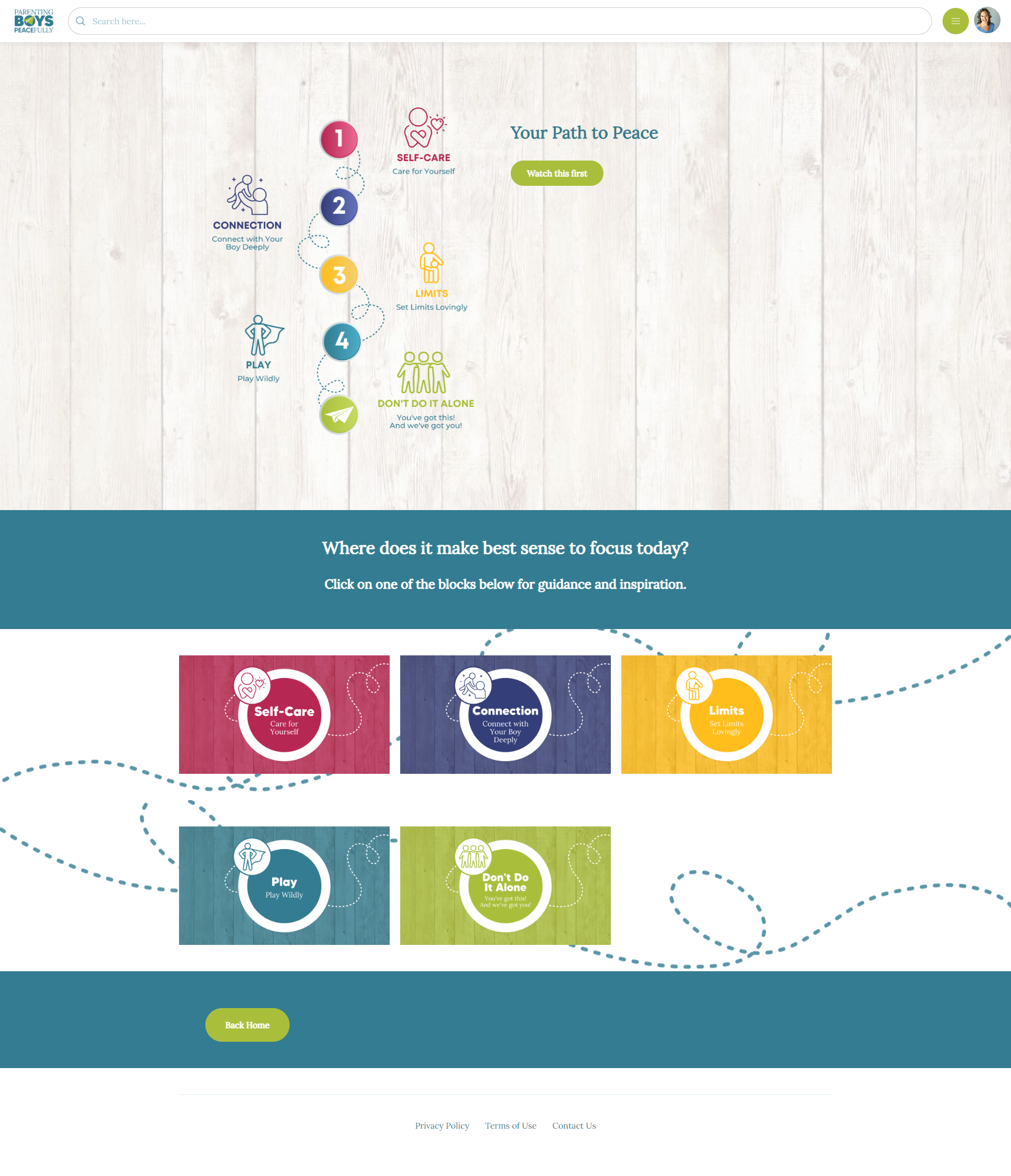
Parenting Boys Peacefully: A calm onboarding journey that guides parents step-by-step so they don’t feel lost. www.parentingboyspeacefully.com
Authorpreneur by Hay House This Membership.io experience is a strong example of pathway-based learning done well at scale.
Rather than overwhelming members with everything at once, the Authorpreneur hub is organized into clear, sequential pathways. Each pathway walks participants through a specific phase of the author journey, with lessons presented in a logical, confidence-building order.
Members always know where they are, what they’re working on, and what comes next. The structure supports focus and momentum without rushing the process.
Built-in search and keyword functionality make it easy to locate specific lessons or assignments when needed, while the pathway layout keeps the bigger picture intact.
Why this works:
Clearly defined pathways that simplify a complex, multi-stage process
Lesson groupings that make progress feel achievable
A balance of guided learning and self-directed exploration
A structure designed to support large numbers of participants consistently
This is a great example of how Membership.io can support a high-touch learning experience for a large brand, without losing clarity or direction.
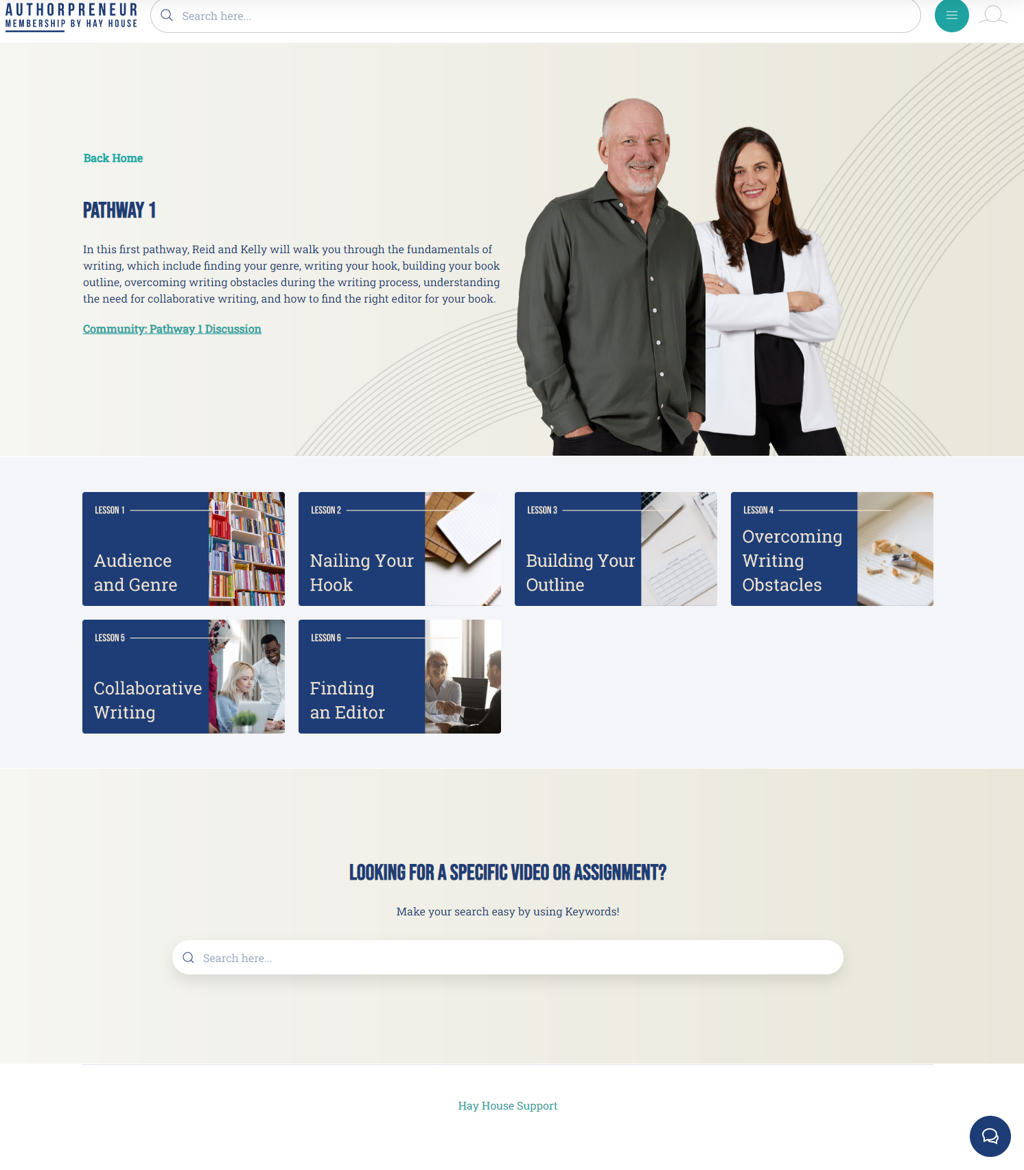
Authorpreneur by Hay House Clear pathways answer the "Where am I?" question instantly for authors at different stages. www.hayhouse.com
School of Better Eyesight This Membership.io experience is a strong example of structured, supported onboarding done well.
From the first visit, members are guided through a clear Begin Here sequence with simple, numbered steps. There’s no guessing and no pressure to figure things out on their own. Each step gently introduces a different part of the experience, from navigating the membership to accessing courses, community, tools, and support.
What really stands out is the balance between self-paced guidance and live human connection. Members are invited to join live onboarding sessions, with easy access to replays, so no one feels left behind if timing doesn’t line up.
Why this works:
A clearly defined onboarding path that removes uncertainty
Step-by-step guidance that builds confidence gradually
Live onboarding options that add real human support
Clear access points to courses, community, and help
This is a great example of how thoughtful onboarding creates trust, reduces overwhelm, and helps members feel supported from day one.
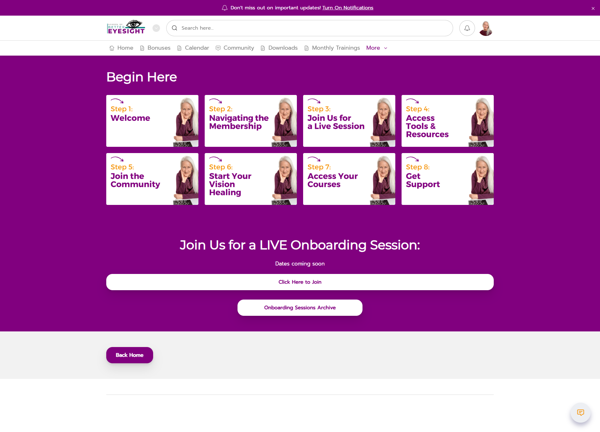
School of Better Eyesight The "Begin Here" section ensures new members find their footing before diving into the library. https://www.schoolofbettereyesight.com/
Pilates Tonic Online This Membership.io experience is a great example of meeting people exactly where they are and guiding them step by step.
Instead of asking members to figure out what they need on their own, the onboarding experience walks them through a clear membership journey. Each stage builds on the last, helping participants assess their body, find alignment, build balance and strength, and move toward embodiment at a pace that feels supportive, not rushed.
Why this works:
A clearly defined journey that removes the guesswork of where to start
Simple, numbered steps that make progress feel doable and reassuring
A natural flow from assessment to deeper practice without overwhelm
Clear next actions so members always know what to do next
This approach mirrors real life. You don’t have to do everything at once. You just take the next right step.
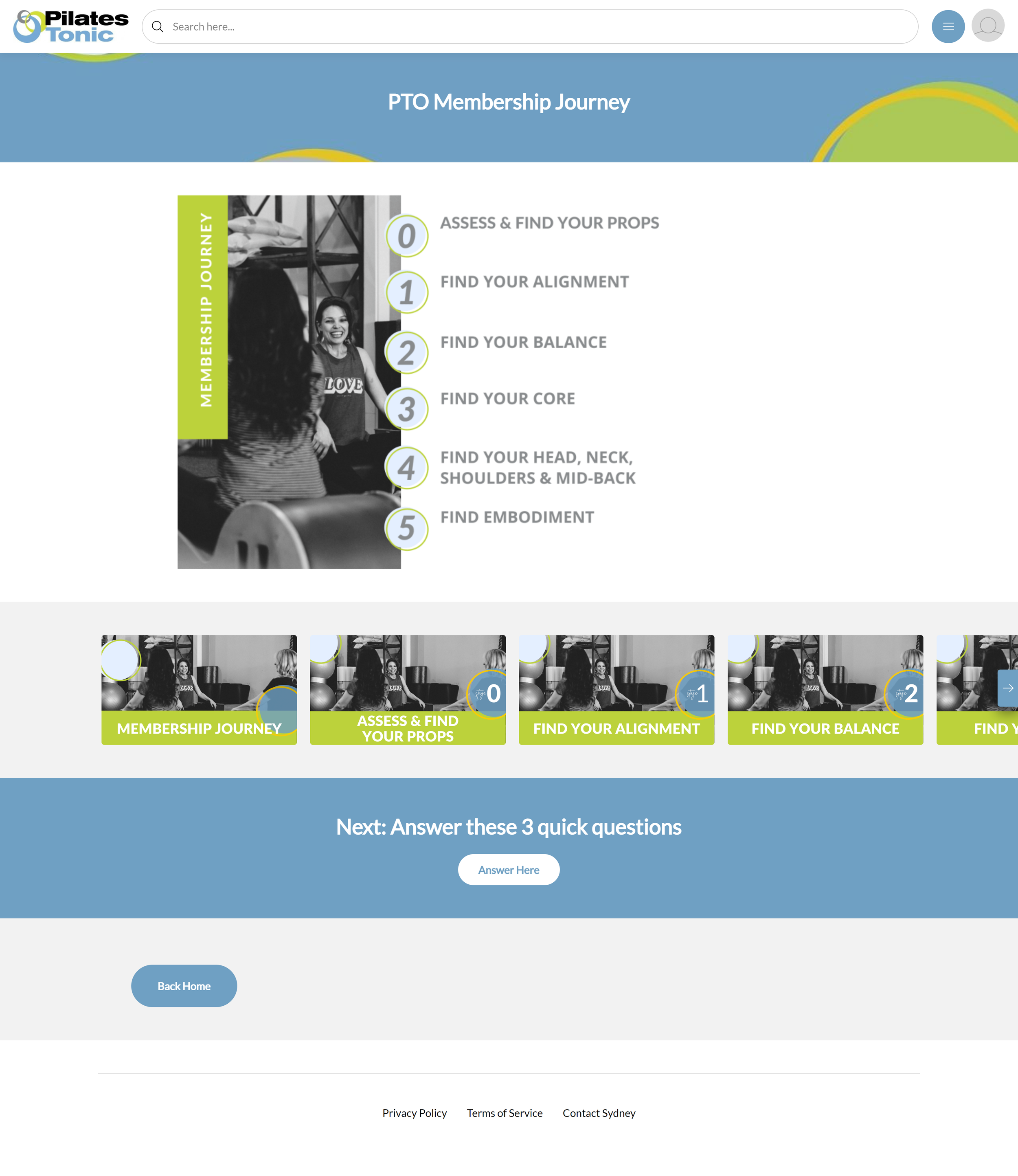
Pilates Tonic Online Real-life filters allow members to search by how much time they actually have today. www.pilatestonic.com
Examples of Curated & Content-Rich Libraries
These examples show how to handle large volumes of content without creating chaos.
InstaClub is a great example of handling a lot of ongoing content without chaos.
Members are guided based on their answers and experience level. They are not handed the entire library all at once - that’s what their old platform did. Users were so overwhelmed and confused, they were leaving the membership.
Making the change to Membership.io and a clearly defined path reduced their churn (rate people leave membership) by 50%!
Now, new content is added weekly, while older trainings are carefully archived and easy to search.
Why this works:
Members see only what is relevant to them
Progress feels achievable as skills grow
Weekly content adds momentum without overwhelm
Past trainings stay useful instead of disappearing
Members are encouraged to search first. The library grows, but it stays easy-breezy. Clear, contained, and easy to navigate. That is not accidental.

Segmented audience feature on homepage of InstaClubHub for Chalene and Brock Johnson

Question & Answer page on InstaClubHub for Chalene and Brock Johnson. Features the search section first and foremost and then Q&A replays by date and topic.

Clean hero section on homepage of InstaClubHub for Chalene and Brock Johnson
Gallop This Membership.io experience is a strong example of organizing a deep, content-rich library without making it feel overwhelming.
From the start, members are oriented to what’s available and how to navigate it. Key resources like live events, replays, expert sessions, and FAQs are surfaced clearly, so people don’t have to hunt for what they use most.
Content is thoughtfully curated into topic-based collections that reflect real health questions and concerns. Instead of scrolling endlessly, members can explore by area of interest or search for exactly what they’re looking for when something specific comes up.
Why this works:
Clear entry points that help members orient themselves quickly
Curated topic groupings that make a large library feel manageable
Easy access to live events, replays, and expert content
Search functionality that supports both browsing and targeted questions
This is a great example of how Membership.io supports thoughtful exploration. Members are given structure and guidance, while still having the freedom to follow their own curiosity and needs.
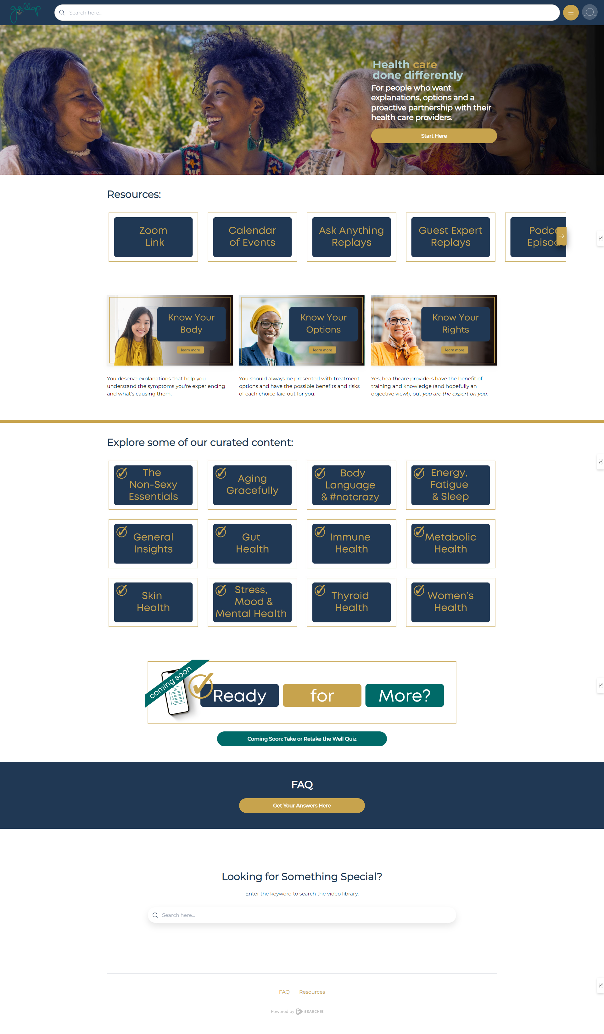
Gallop Quick shortcuts to calendars and replays keep the user experience smooth and friction-free. https://www.gallop.health/
The Happy Engineer Podcast Library This example shows how Membership.io can dramatically extend the life of a podcast.
Episodes aren’t treated as one-and-done content. They are organized by theme, challenge, and desired outcome so listeners can find what they need without endless scrolling of podcast titles.
Highlights include:
Topic-based navigation tied to real-world challenges
Strong search functionality (great for those who may not find what they need in the primary “buckets”)
Clear bridges from free content into deeper support
Thoughtful use of testimonials and social proof
It turns a podcast archive into a living, helpful resource.
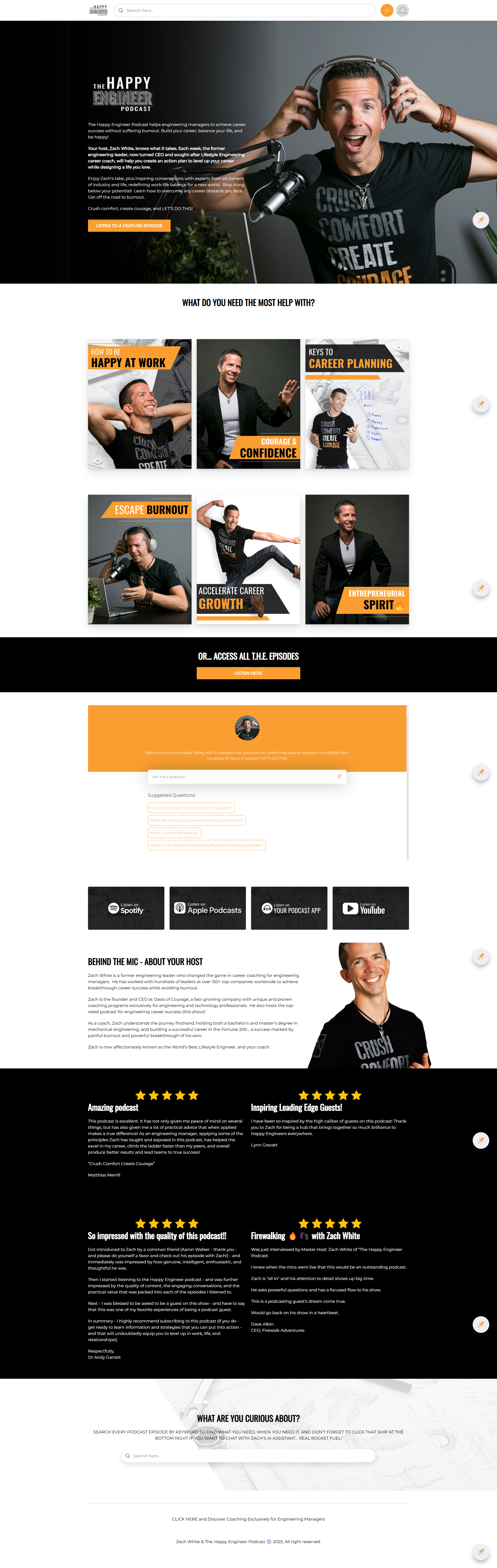
The Happy Engineer Podcast Library: Podcast episodes organized by real-world challenges, turning an archive into a helpful library. www.thehappyengineer.com
Agrarian Training Hub The Agrarian Training Hub shows how Membership.io can support operational and product-based teams.
Instead of organizing content by format, this hub mirrors how sales teams actually work. Each thumbnail visually represents a real document or tool. People can find what they need even if they don’t know the exact name.
The move to Membership.io significantly reduced calls to the office from panicked sales people who couldn’t find what they needed.
Why this works:
Visual thumbnails that feel familiar immediately
Fast, self-serve access for people working in the field
Fewer internal requests and less admin back-and-forth
One centralized, always-current source of truth
It is a great example of Membership.io saving time and taking a big chunk off the mental and administrative load. That relief matters.
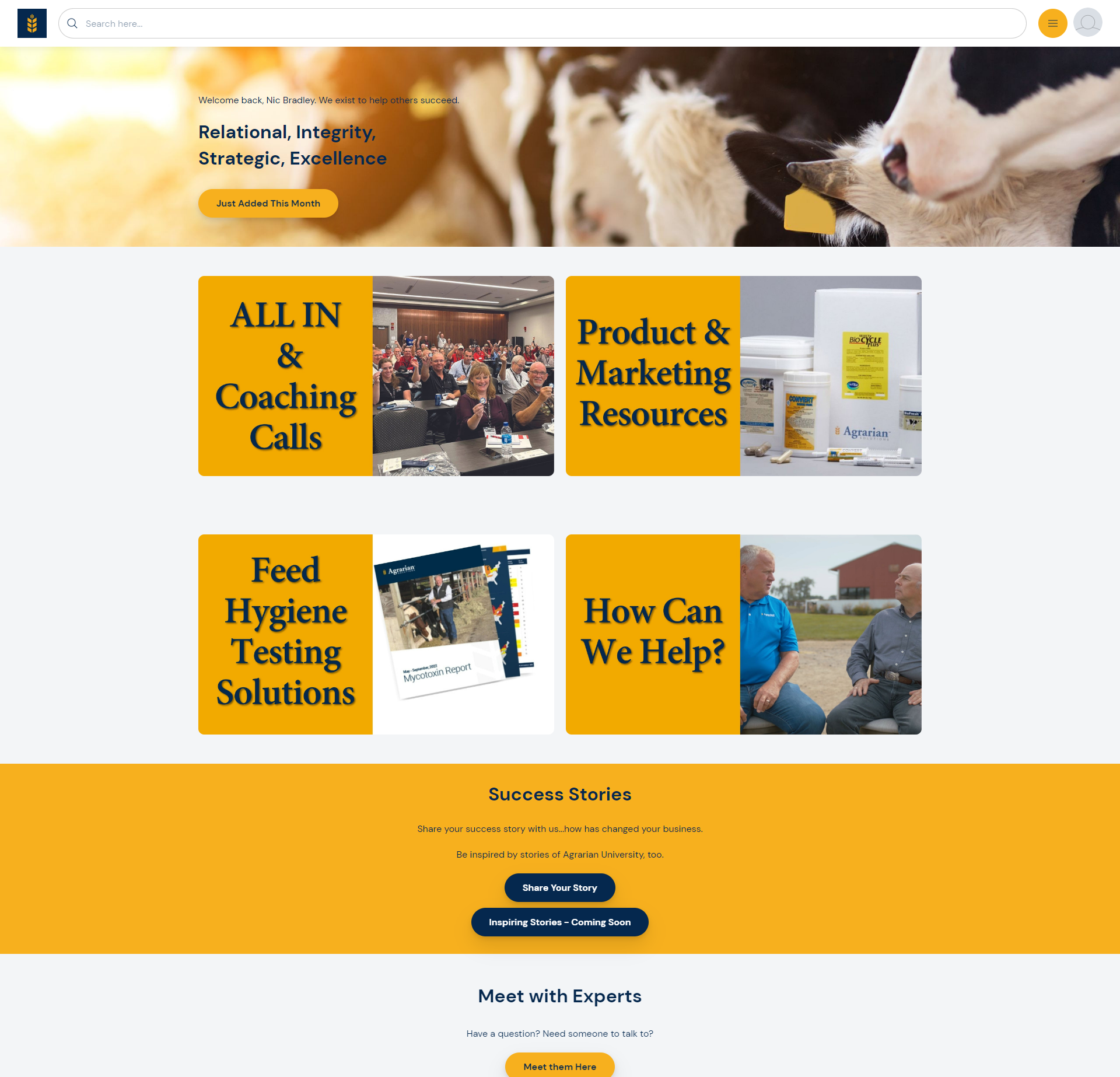
Agrarian Training Hub: Visual thumbnails make it easy for the team to grab exactly what they need in seconds. https://agrariansolutions.com/
Examples of Community & Specific Use Cases
These examples highlight unique setups, from community-first hubs to corporate leadership.
Daily Tonic Community This Membership.io experience is a strong example of a community-forward hub, where connection and participation matter just as much as content.
While there is content available, the heart of this space is the community itself.
The design, layout, and pinned guidelines clearly communicate that this is a shared container. Members are encouraged to show up, support one another, and participate in ongoing conversations, not just consume information and leave.
Clear guidelines are presented right away to establish tone, boundaries, and emotional safety. Topics are thoughtfully organized so conversations feel grounded and easy to follow, and the overall visual design reinforces a sense of warmth and belonging.
Why this works:
Community is positioned as the main experience, not an add-on
Clear guidelines set expectations and create emotional safety
Topic-based organization helps conversations stay focused and supportive
A familiar, Facebook-like community experience inside the hub reduces friction
This is a great example of how Membership.io’s community features can be used to build connection, trust, and peer support, all within a branded space you own.
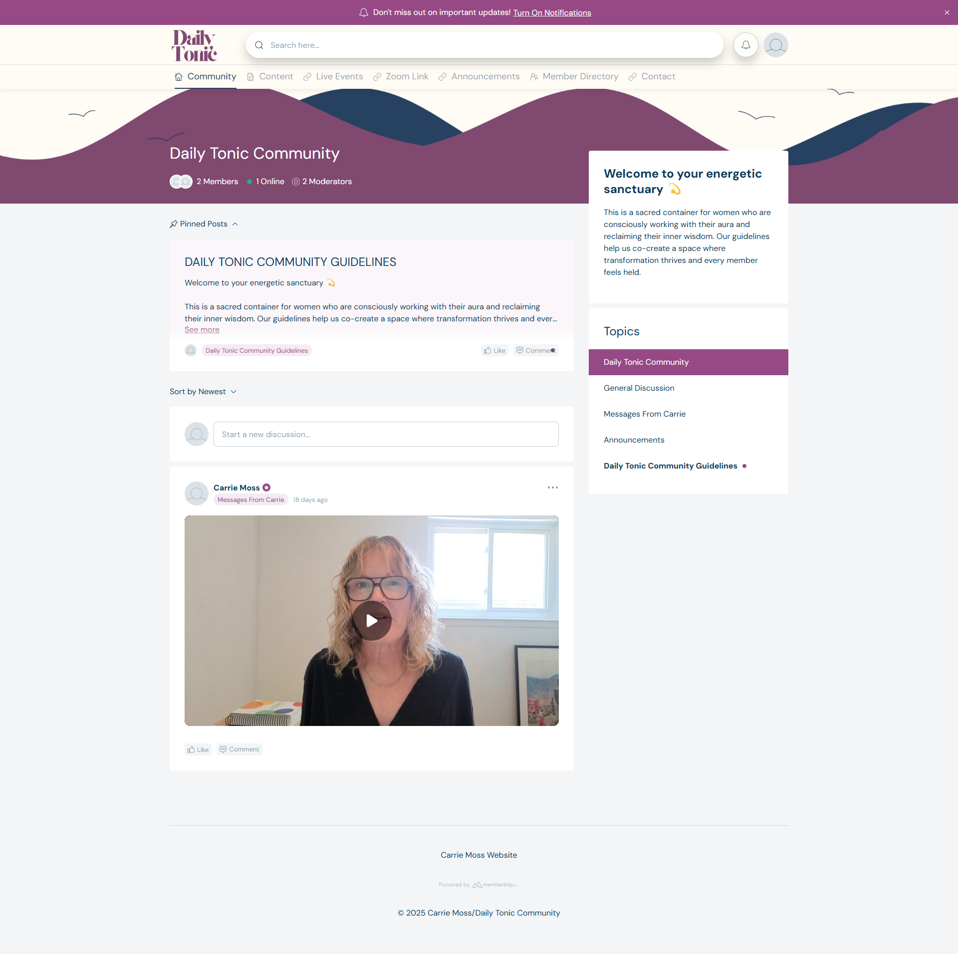
Daily Tonic Community Pinned posts and clear topics set the tone for a welcoming, safe community space. https://carriemoss.co/
Swivel Leadership Development hub is a polished, professional leadership experience.
It supports structured learning modules, a reference-style leader library, and a clear calendar for live sessions.
What stands out most is the intentional separation between learning, reflection, and live engagement. Participants can move at their own pace without losing the sense of being part of something larger.
Resources are presented in the same way with every lesson so the user feels they have what they need at their finger tips. No hunting!
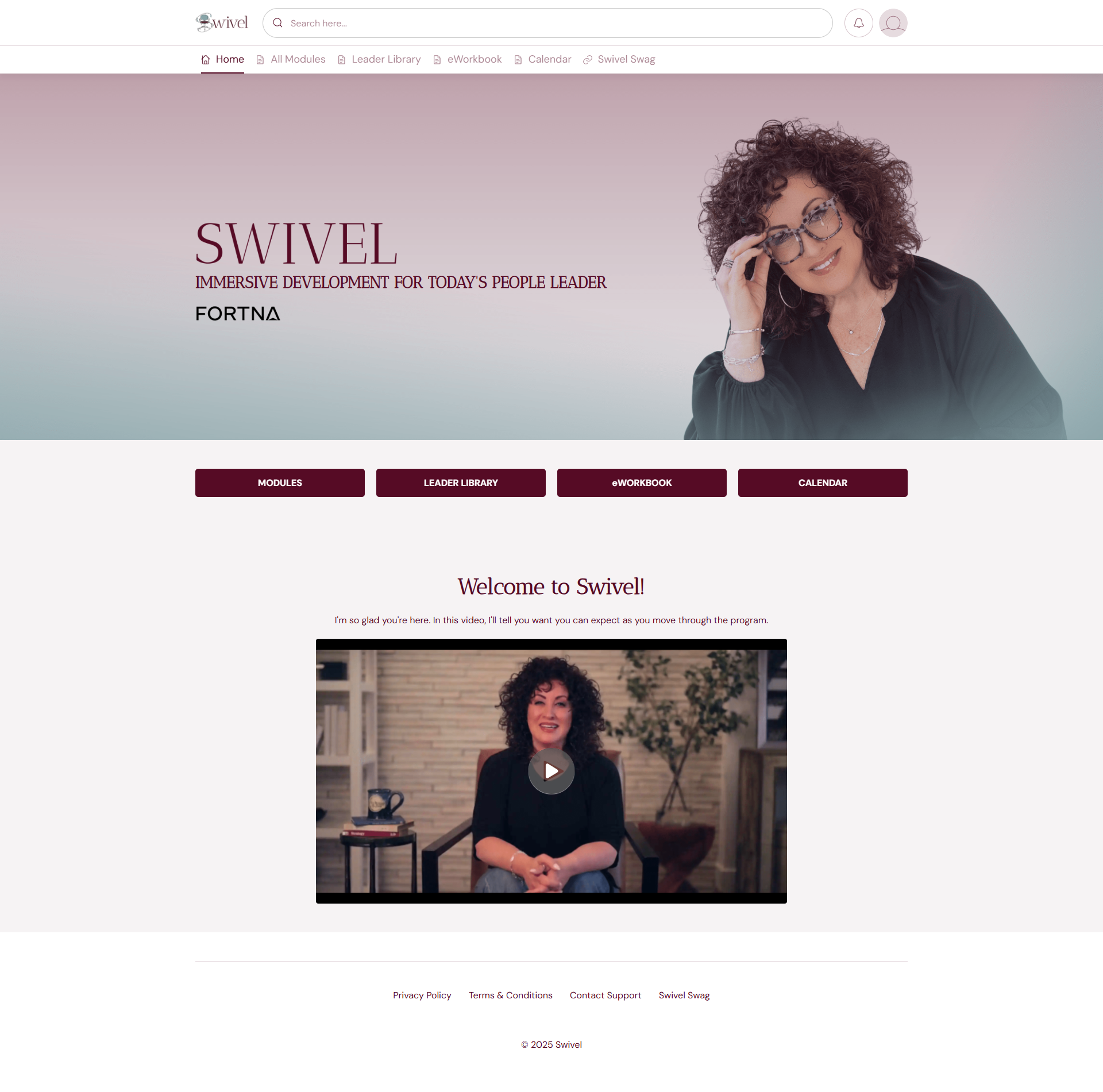
Swivel Leadership Development: A polished layout that clearly separates learning modules from live session calendars. www.swivelteam.com
Connection Codes Connection Codes is a masterclass in intentional simplicity.
Instead of piling on options, the experience focuses on a few core elements like masterclasses, curated podcast content, and community support. Calls to action like "Play" replace generic labels and reinforce ease.
Why this works:
Calm, consistent visual branding
A built-in assistant to help people find content quickly
A spacious layout that matches the tone of the work
In this case, restraint is what creates clarity. It is a very intentional choice.
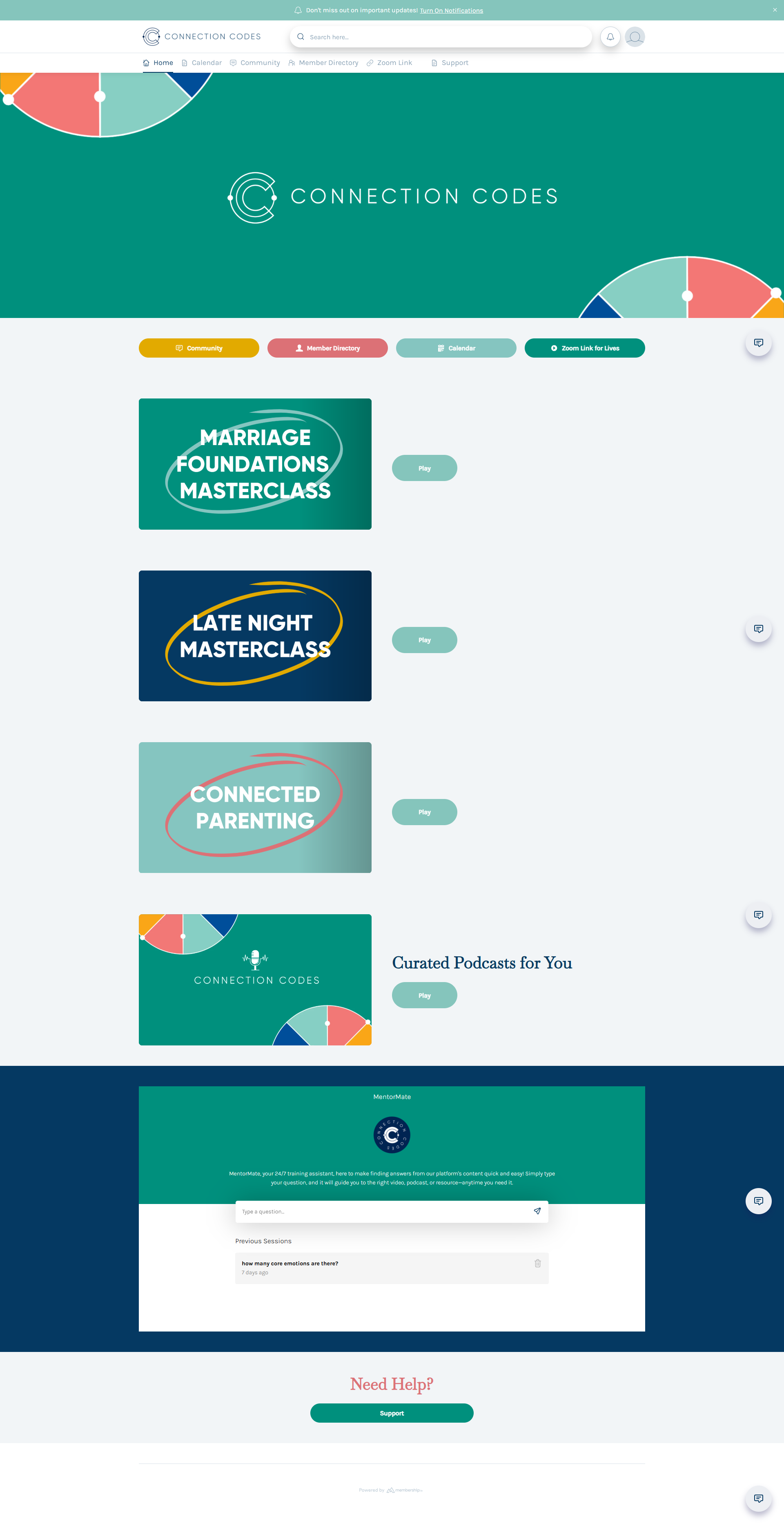
Connection Codes: Intentional simplicity: The "Play" call-to-action keeps things feeling light and doable. www.connectioncodes.co
Preschool Power Up Preschool Power Up shows how Membership.io supports non-traditional education.
Bright visuals and friendly language help a large library feel approachable.
Why this works:
A welcoming homepage that feels personal
Content grouped the way educators think
A visual progress path without urgency
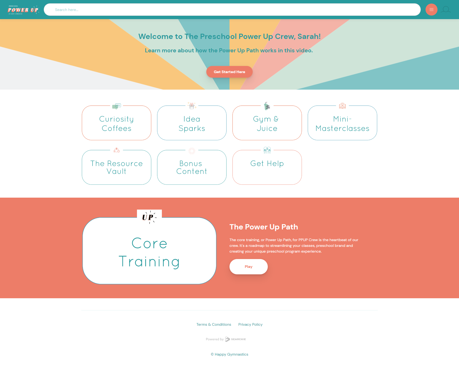
Preschool Power Up Friendly visuals and a clear progress path make a large library feel approachable. https://www.happygymnastics.com/preschool-power-up
Examples of Search-Driven & Filtered Experiences
These "Classic" examples show how to let the user design their own experience through tagging.
Sherry Jibb – Balanced Midlife Membership for Women This is a Hub I built many years ago but is still one of my favorites and an excellent example of how to focus a membership on what the user needs and wants.
This Membership.io experience reflects Sherry’s brand not just in how it looks, but in how it supports decision making.
Instead of telling members what to do next, the hub is organized in a way that lets them choose based on what they actually need that day. Time. Energy. Ability. Focus.
Members can easily select classes by length, level, or type, making it simple to find something that fits into real life. Ten minutes or sixty. Beginner or advanced. Movement, breath, or gentle stretching.
This is all supported by cohesive thumbnails that help the user orient themselves, no matter where they are in the hub.
Why this works:
Clear, intuitive filters that support autonomy and self-trust
Organization that honors fluctuating energy and capacity, especially in midlife
Consistent branding that reinforces calm and confidence throughout
A structure that encourages showing up without pressure to do more
This is a strong example of how thoughtful organization and brand-aligned design work together to create an experience that feels supportive, flexible, and deeply human.
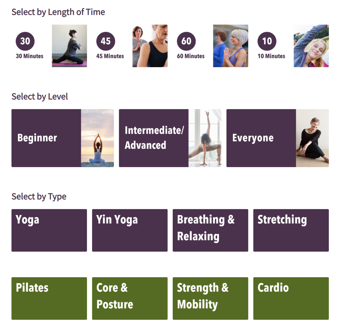
Sherry Jibb – Balanced Midlife Membership for Women Detailed tagging allows members to find the perfect workout by length, level, or style. https://sherryjibb.com/
Katie Pitts – Rested Exclusive Membership (REM) This Membership.io experience is designed around how parents actually look for help, especially when short on time. (This is another oldie but goodie!)
Instead of asking members to translate their problem into course titles or lesson names, the hub lets them explore by age and topic. Newborn. Baby. Toddler. Older kids. Early mornings. Naps. Schedules. The things parents are dealing with right now.
Members don’t have to think hard or search endlessly. They can click into what matches their current season and get support quickly.
A monthly Deep Dive feature offers focused guidance on a specific sleep topic, while the rest of the library remains easy to browse or search as needed.
Why this works:
Organization based on real-life questions, not content formats
Age-based navigation that meets parents where they are
Topic groupings that reduce overwhelm in high-stress moments
A balance between quick answers and deeper education
This is a strong example of how thoughtful structure turns a large content library into something that feels manageable, supportive, and usable when people need it most.
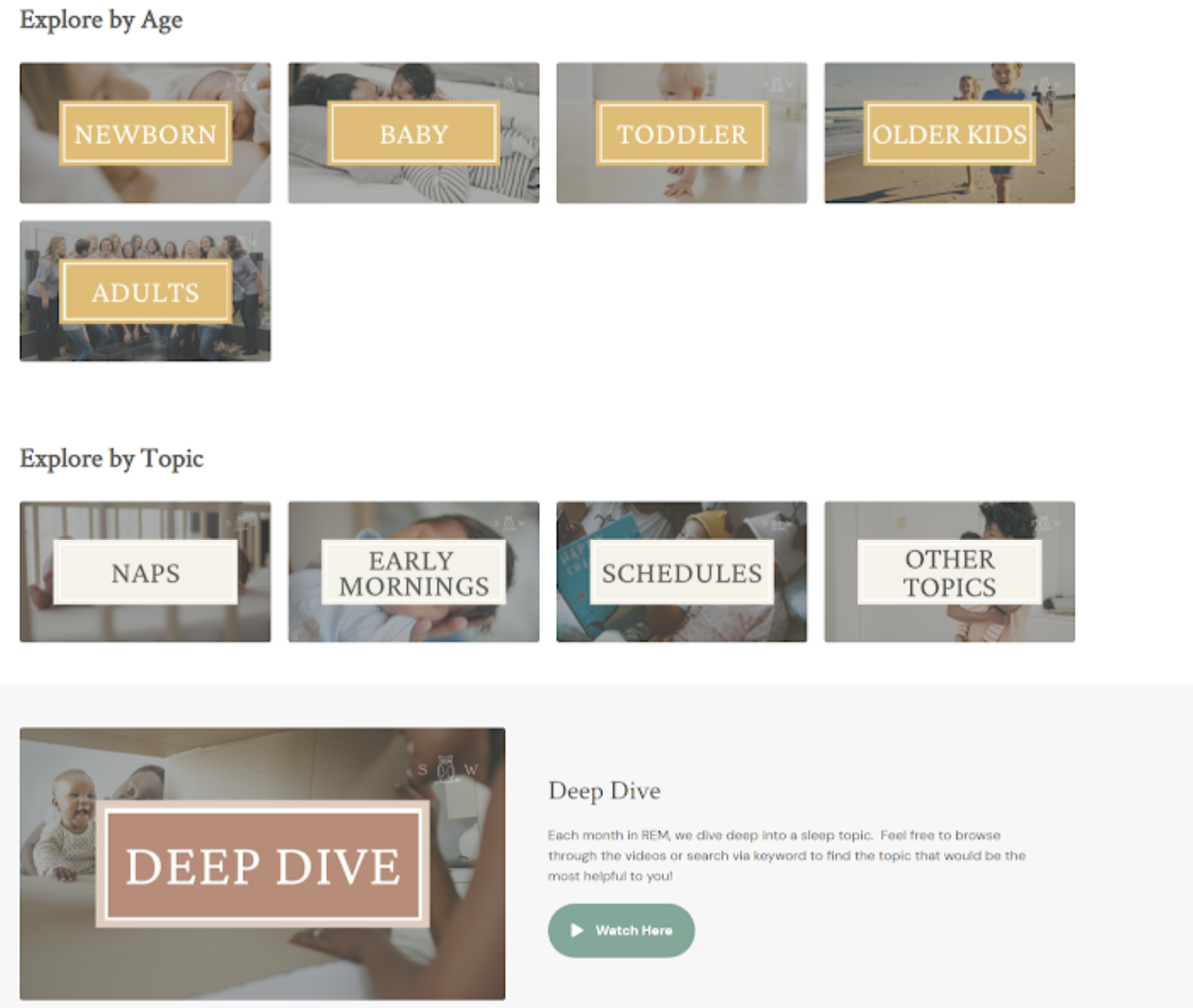
Katie Pitts – Rested Exclusive Membership (REM) "Search by Age" helps tired parents get straight to the answer they need right now. www.sleepwiseconsulting.com
What to Take Away From These Examples
Here is the part I want you to really hear.
You do not need a massive content library. You do not need everything finished before you start. You certainly do not need a complicated tech stack.
You just need:
Clear entry points
Simple navigation
Structure that reflects how people actually think
That is what thoughtful Membership.io design makes possible.
Why Membership.io and Why Shell Creative
Membership.io has grown far beyond its original Searchie roots.
Today, it is a powerhouse for guided onboarding, community, gamification, and clear learning paths. It creates the kind of clean, branded experience that makes members stay.
But a powerful tool is only useful if it is actually built.
I have been working with this platform since the very beginning. I have built hundreds of hubs and have nailed a streamlined process. I know the shortcuts, and I know where people get stuck.
That is why I offer the Membership.io VIP Day.
It is a focused, done-for-you experience where we take your hub off your plate and get it handled.
Clients often tell me, "It would have taken me forever to do what you finished in a day."
We stop the guesswork and the procrastination. We build a clear, organized hub you actually feel good sharing.
If you want to trade the overwhelm for a "Shell, yes!" moment—where your hub is finally done, launched, and off your to-do list—I’ve got you.
You don’t have to carry this alone. Let’s get it done in a day.
Shell, yes. Here’s to your success.


*Some of these links are affiliate links, which means I may get a commission if you purchase. However, none of the fees of these resources have been increased to compensate me. When possible, if special discounts are provided to me, I extend them to you!
Feeling overwhelmed by your content? See real Membership.io examples that turn messy files into calm, easy-breezy hubs. No tech headaches. Just clarity.